Printing materials are rich with elements of everyday life, adding vibrant color and depth to our visual experiences. But what makes a print truly high quality? What should you be aware of during the printing process? This article explores some of the most challenging colors to print, along with essential design tips that can help ensure better results.
One of the trickiest aspects of printing is achieving proper **gray balance**. Gray balance refers to the way cyan, magenta, and yellow inks are combined at specific dot percentages to create neutral grays of varying brightness. This process is highly sensitive to factors like ink density, paper type, screen resolution, and overprint settings. It’s a true test of both the press’s precision and the operator’s skill.
Another common issue is the use of **four-color screens versus three-color screens**. Full-color prints (especially those using four-color process) can sometimes lead to unexpected results if not handled carefully. In some cases, it's better to use **spot colors** instead of full-color for more consistent and accurate results.
Designs created by people unfamiliar with the printing process often face significant challenges. For example, overly complex color gradients, thin lines, or tiny text may not translate well during printing, leading to poor visibility or loss of detail.
Printing large flat areas with equal percentages of all four colors—like 50% cyan, 50% magenta, 50% yellow, and 50% black—can cause a strong color cast if the registration is even slightly off. This is especially problematic in mass production.
Text printed in all four colors (CMYK), particularly small text, can be very difficult to align properly. The press must handle these details with extreme precision. If the black text isn’t isolated on the black plate, it can result in blurry or uneven text, reducing the overall quality of the final product. When converting from RGB to CMYK, black text can unintentionally become a four-color black. Always double-check your files before sending them to print.
Black backgrounds can also be tricky. To achieve a deep, rich black, printers often use **special black ink** or apply an extra pass. While this method ensures better results, it requires more time and effort.
When multiple color dots overlap—especially above 70% dot coverage—color balance becomes extremely difficult. Dark tones like brown, dark green, dark blue, and purple-blue can easily look inconsistent on press due to slight variations in ink application.
Full-page designs, large spot color areas, reverse white text, and repeated logos or color blocks are all challenging to match consistently. These elements are prone to issues like color shifts, ghosting, smudging, or scratching.
In short, a high-quality print must meet several key standards: accurate registration, uniform ink color, clear and complete dots, proper ink balance, and freedom from defects such as smudges, scratches, or misregistration. Most importantly, it should closely resemble the original design. Printing companies must continuously strive for excellence to meet the growing demand for visually appealing and professional-looking printed materials.
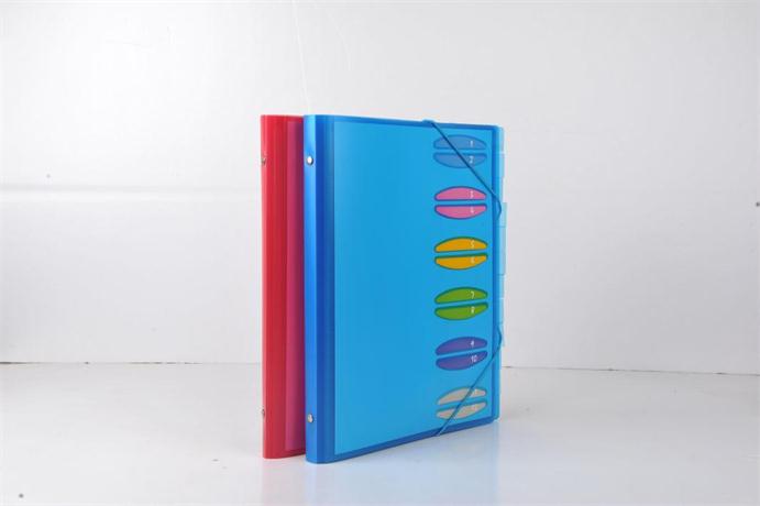
Folder is specially used to hold the whole page of documents, the main purpose is to better save files, make it neat and regular.Split page folders are easy to categorize by user.The cover has a clear classification of entries, according to which users can quickly find the corresponding data.Generally separated folders with elastic rope closure, more convenient

File Package,File Folders,Storage Package,Frosted Multi Layer File Package
shaoxing chaofeng stationery manufacturing CO.,LTD. , https://www.chaofengstationery.com