Printed materials are filled with elements of everyday life, adding vibrant colors and visual appeal to people's daily experiences. But what makes a print truly high quality? What should you be mindful of during the printing process? In this article, we'll explore some of the trickiest colors to print, along with practical design tips that can help ensure better results. Let’s dive in.
1. Gray Balance: One of the most challenging aspects of color printing is achieving proper gray balance. According to both theory and real-world experience, gray balance refers to the way cyan, magenta, and yellow are overlaid in specific dot percentages to create neutral grays of varying brightness—from white to black. Several factors influence this, such as ink density, paper type, screen frequency, and overprint accuracy. It's a true test of the printer’s precision and the operator’s skill.
2. Avoid using 4-color screens for solid areas; instead, use spot colors whenever possible. This helps prevent unwanted color shifts and ensures more consistent results.
3. Designs created by those unfamiliar with printing processes often pose significant challenges. Common issues include excessive color gradients, thin lines, tiny text that appears too light, or even white-out effects that can ruin the final output.
4. A large flat area with equal percentages of cyan, magenta, yellow, and black (C=50%, M=50%, Y=50%, K=50%) can easily develop a noticeable color cast if the registration is even slightly off.
5. Text printed in all four colors (CMYK) is particularly difficult, especially small text. The machine’s gripper must be precise to avoid misalignment. This is a common issue, so designers should always check that black text is only on the black plate and not spread across other color plates. If it is, the print quality will suffer. When converting from RGB to CMYK, black text may automatically become a four-color black unless specified otherwise.
6. Black backgrounds can be tricky to handle. To achieve a rich, deep black, special black ink or double-pass printing is often used. While effective, this method requires more time and effort.
7. Overlapping color dots, especially above 70% dot coverage, can lead to color imbalances. Dark brown, dark green, dark blue, and purple tones are particularly hard to match due to their complex color compositions.
8. Large full-page prints, whether full-color or using large spot color areas, can be difficult to reproduce consistently. Issues like color variation, ghosting, dirt marks, or scratches are common, especially when dealing with reverse white text, logos, or solid color blocks.
In conclusion, high-quality prints require attention to several key factors: accurate registration, consistent ink color, well-formed halftone dots, proper ink balance, and the absence of printing defects like smudging, scratching, or misregistration. Most importantly, they should stay true to the original design. As demand for visually appealing prints continues to grow, printing companies must strive for excellence to meet these expectations.
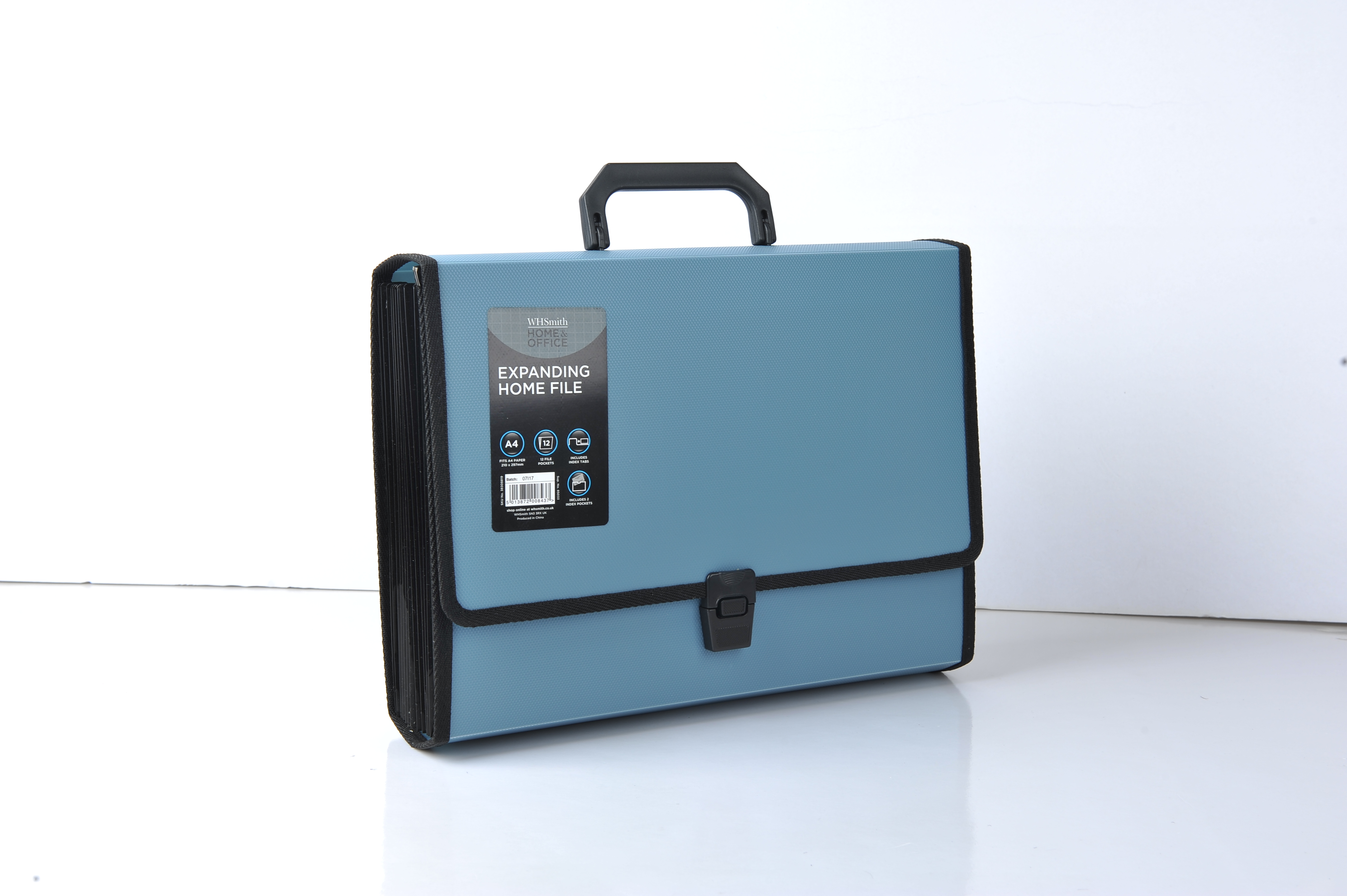
Folder is specially used to hold the whole page of documents, the main purpose is to better save files, make it neat and regular.Folders are tools for storing, protecting and managing paper documents.Materials include PP, PVC, cardboard;There are parts of imitation leather, cloth and so on.There are many kinds of folder categories: including single strong folder, double strong folder, information booklet, two inch folder, three inch folder, different specifications of double open folder, single folder (also known as l-type folder), multi-page folder.

Files And Folders,Filing Products,Folder Products,File Folder
shaoxing chaofeng stationery manufacturing CO.,LTD. , https://www.chaofengstationery.com